KeepFluent
Mobile Responsive Website Design
-
Client: KeepFluent
3 Week Sprint | Group Project
Primary Roles: Research, Interaction Design & Client Communications
Tools: Figma, Airtable, Optimal Workshop, Zoom, Pitch
Teammates: Kaylie Deng, Ian Pang, Théo Munch
-
Insight: Hired to create a mobile responsive website that connects organizations and nonprofits directly to members and service providers in order to deliver resources that benefit communities.
Challenge: Create a new backend dashboard website for non profit organizations to develop events and share resources with their communities.
Goal: Streamline the experience to help KeepFluent to successfully onboard more organizations and create a trusted network.
-
Discovery: Heuristic Evaluation, Competitive & Comparative Research, User Interviews, Contextual Inquiry, Usability Testing
Define: Personas, Feature Prioritization Map, User Experience Journey Mapping, User Flows
Design: Sketching, Wireframes, Figma Prototype
Discovery
Competitive & Comparative Analysis
Why we did this: We wanted to learn from other platforms in similar spaces to see what elements and processes we could implement and improve from existing platforms to make our client’s website stand out amongst competitors.
Our client provided us with two competitor websites to examine. We performed evaluations on both and walked away with an understanding of the strengths and weaknesses for each. We also conducted analysis on two comparative event planning websites to uncover elements that worked well so that we could find inspiration for our KeepFluent platform redesign.
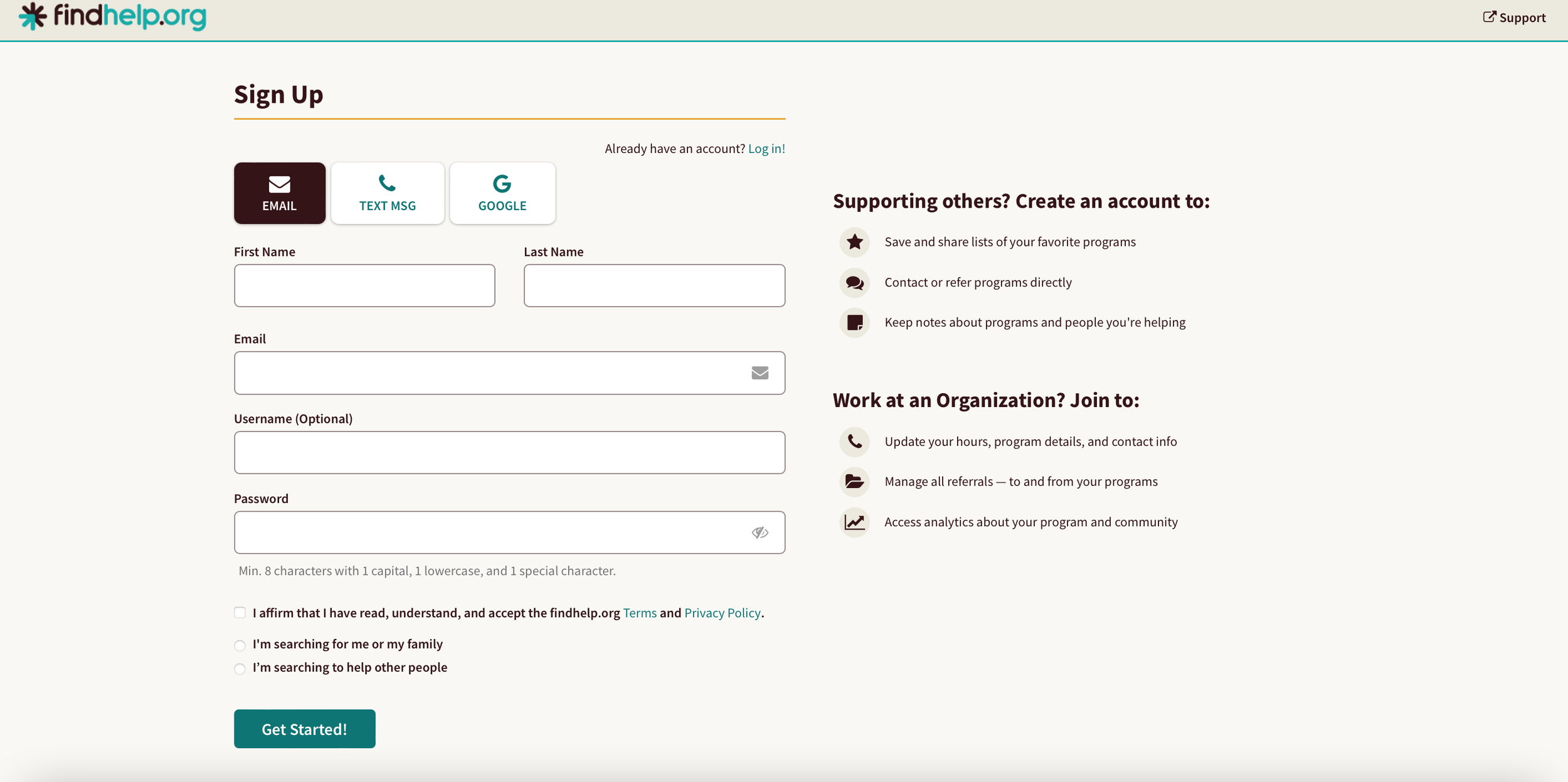
Competitor: Aunt Bertha. Simple and direct onboarding process for organizations with a thorough approval process.
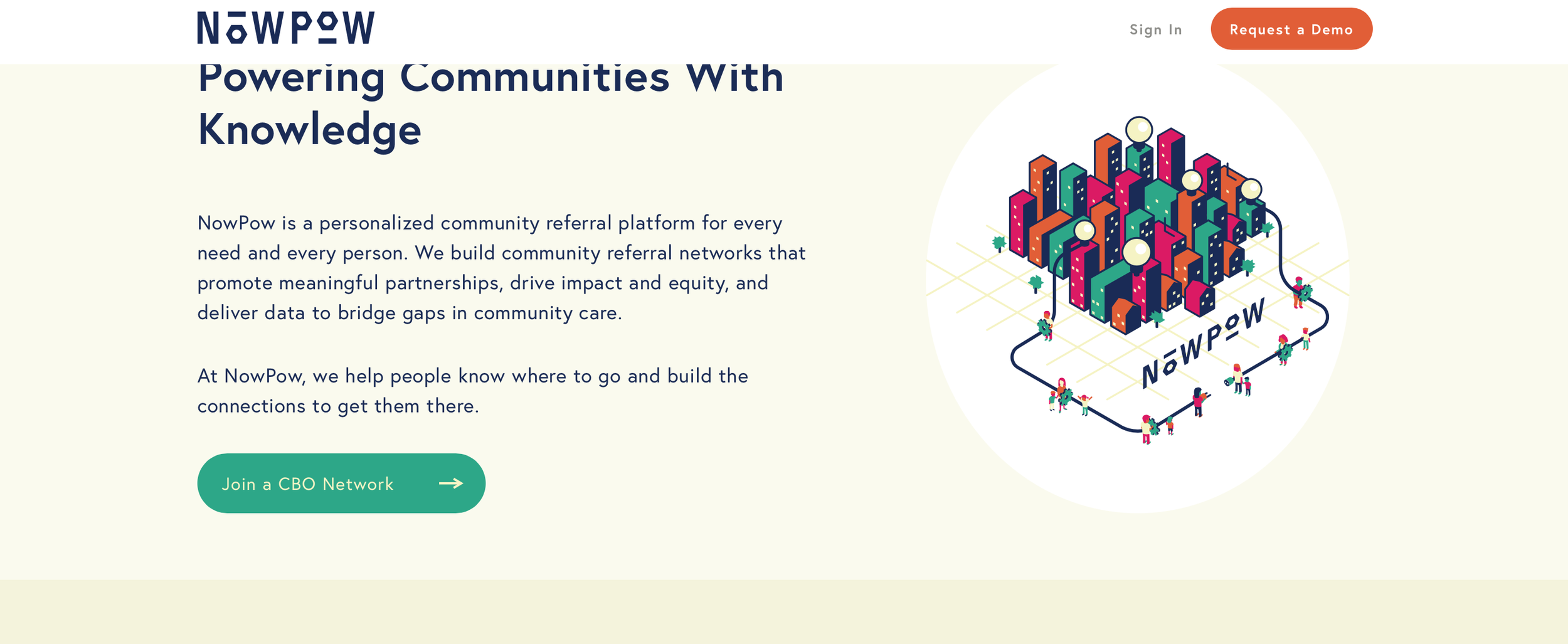
Competitor: NowPow. Clear communication to users through thoughtful UX writing, and strategic UI elements with accessible CTA buttons.
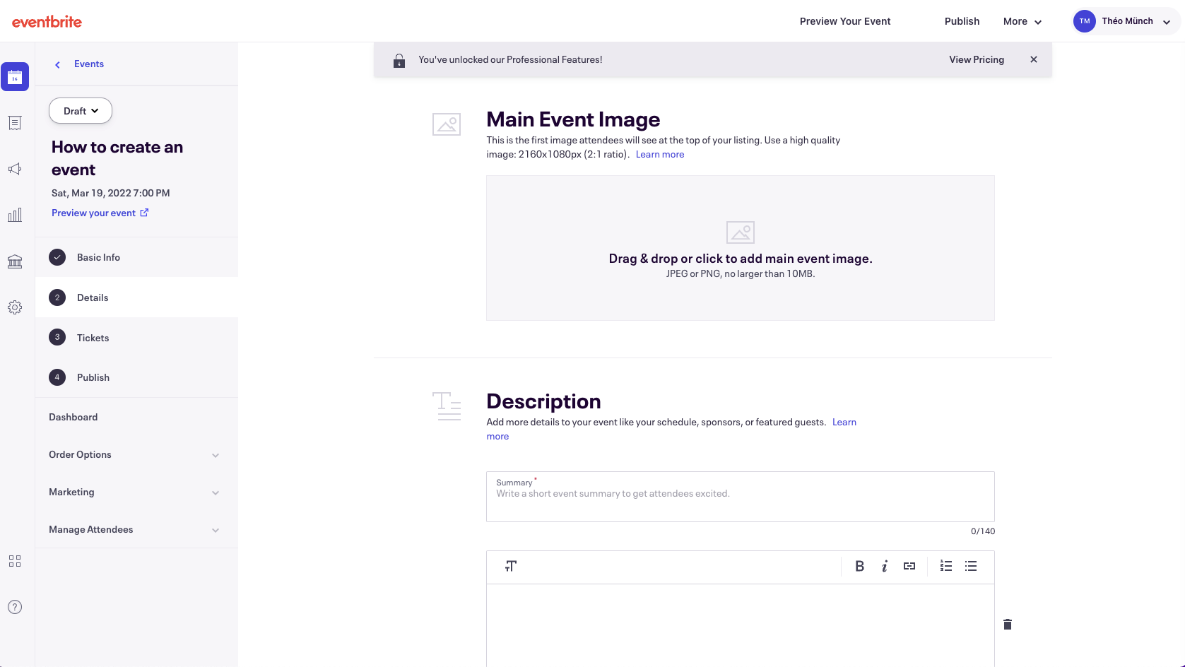
Comparative: Eventbrite. Page by page event creation process for users with a simple, streamlined template for event pages.
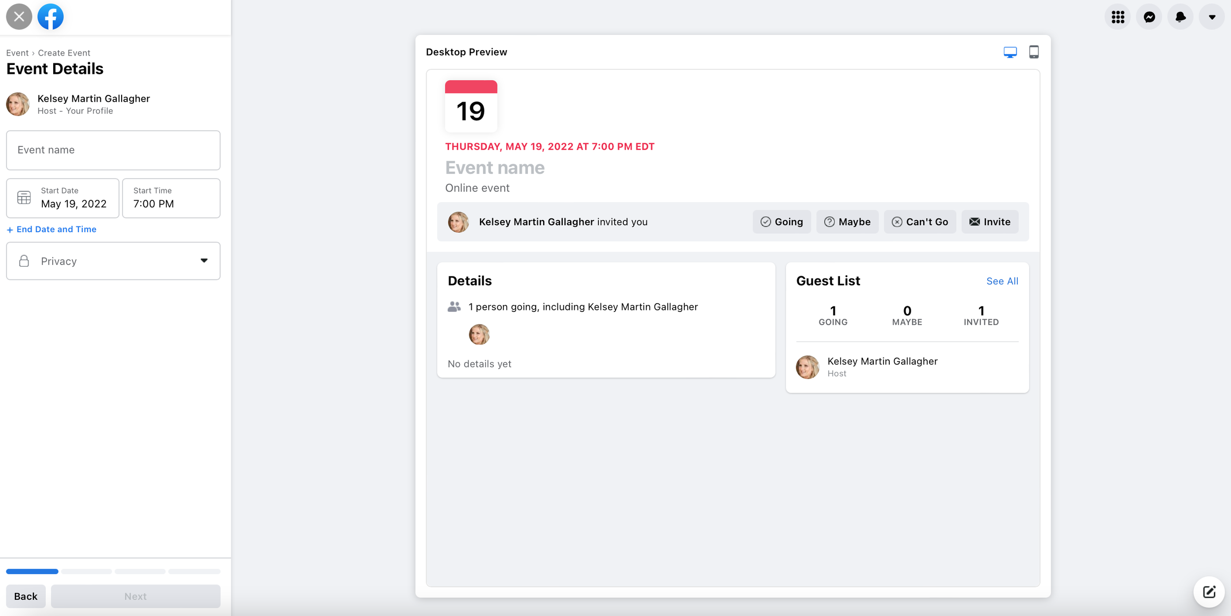
Comparative: Facebook. Event pages are identical, fillable templates with options to add images for personalization. Simple overview of event details and preview page with invites categorized by groups for easy additions and sorting.
Contextual Inquiry
Why we did this: We needed to understand the pain points and preferences of current users on the website so that we could improve the pre-existing interface and keep user’s needs in mind throughout our design process.
We had 4 individuals complete a series of 3 tasks on the current KeepFluent platform.
Task 1: Create an event and invite members of the organization.
75% of users rated this experience 3 or below (Scale of 1-5, 1 being very difficult, 5 being very easy).
Task 2: Send a follow up email to attendees as a reminder for the event.
75% of users rated this experience 3 or below.
Task 3: View the new event created in calendar mode.
100% of users rated this experience 3 or below.
Preexisting Site User Journey Map
We mapped out user’s experiences on the preexisting website to visualize areas for improvement throughout their actions while performing tasks. We shared this map with KeepFluent’s key stakeholders to communicate their client’s current journey on the website and reveal pain paints.
System Usability Score of Preexisting Site
The average SUS rating for the preexisting website experience was a 30. This is well below a 68 which generally shows quality usability in a system.
Goals for Redesign
Improve Accessibility
Simplify Layout
Integrate User Guidance & Onboarding
Implement Direct Labeling & CTA Buttons
Improve System Usability Score.
Define
Jessica, Our Persona
Jessica is a passionate planner and a program coordinator for a start up non-profit organization in Austin, Texas.
Goals
Quickly create and share her organization's upcoming events.
Communicate and deliver vital services to her community.
Pain points
Lacks a streamlined way to share services and events with their community.
Struggles to obtain RSVPs from attendees for events.
Needs an efficient workflow to complete tasks.
Critical Thinking
We considered Jessica’s goals and pain points to define our path forward in design.
We knew Jessica needed a way to create and plan events for her organization to engage new audiences and create a thriving community. We wondered, how might we create a simple platform to plan events, communicate with members, and share details so members can attend relationship-building events?
We also knew Jessica needed an efficient way to share the work of service providers who help her community and deliver services to highlight her organization’s work. We wondered, how might we create an all-in-one platform to lead organizations through the entire discover to deliver process of sharing resources through service providers?
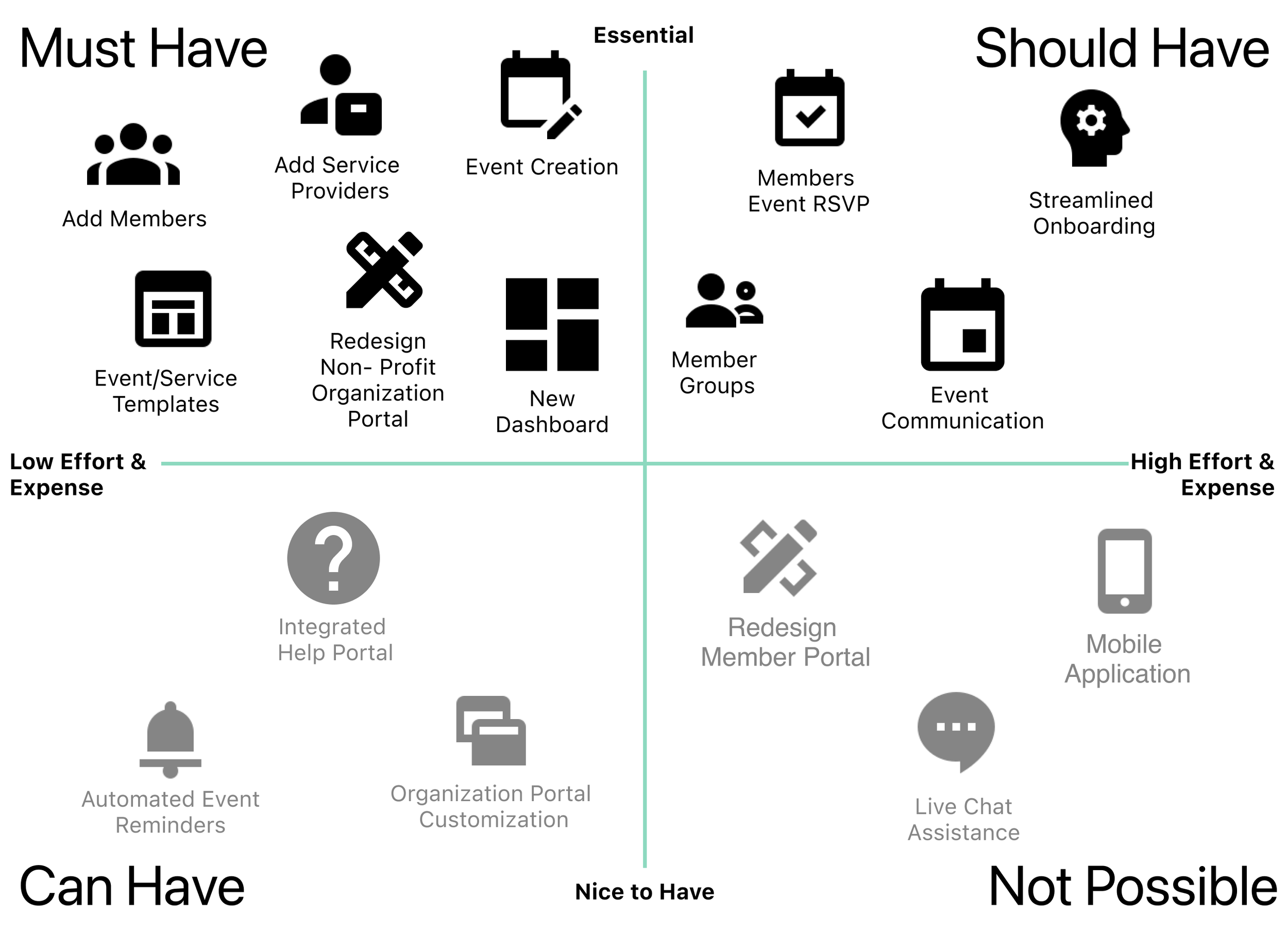
Feature Prioritization Map
We created a prioritization map to align our research and design team on the most important features to include in our early stage designs.
User Flows
Based on our user’s needs as defined by our persona, Jessica, we developed two user flows to move forward with to make sure that our designs would implement actions based on her use within the website as a program coordinator for a non-profit organization.
Design
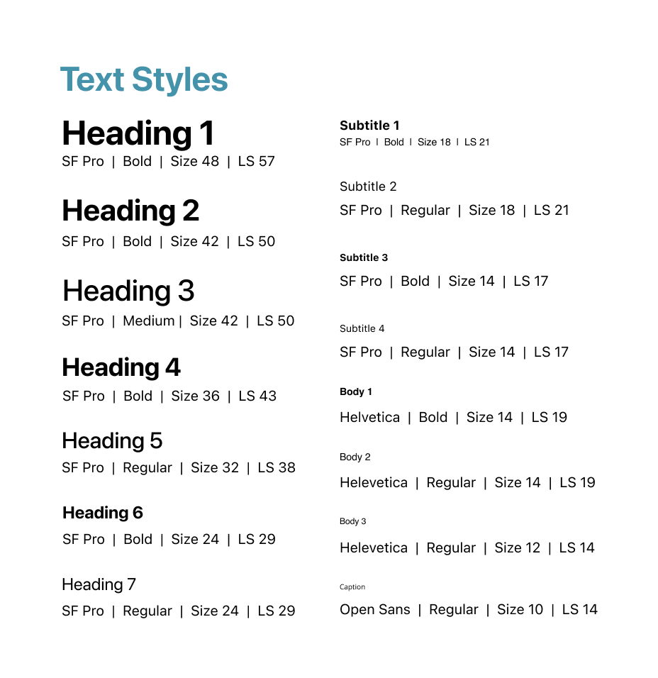
Style Guide
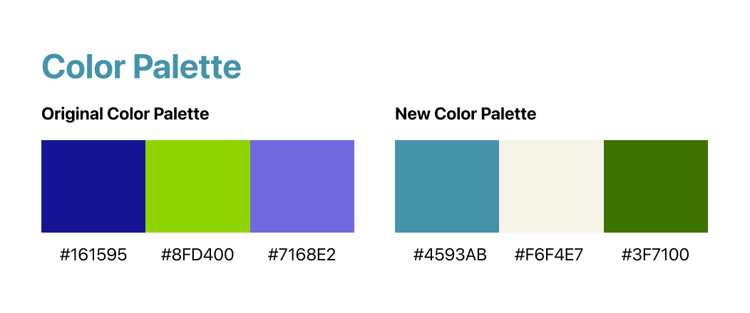
We developed a style guide for our website and tested new color palettes.
We asked users to choose a color palette during testing. 100% of participants chose the new palette below and commented that the colors were more soothing and easy on their eyes. One participant explained that she was “…not a big fan of that lime green, and the dark blue is kind of hard to read..." in the original colors.
Wireframes
Based on our user flows, we sketched out what the mobile responsive website would look like. We converted our early stage sketches into low-fidelity black and white wireframes and made a prototype to test. Ultimately, we transformed our prototype into the color mid-fidelity wireframes after user testing. See below a peek into the evolution of key screens for the dashboard and both user flows.
Usability Testing
We remotely conducted usability testing with six users of the current platform. We asked them to perform our two user tasks as outlined in the user flows and recorded their experiences. We created this journey map to show our user’s experiences on the reinvented platform to share with stakeholders and compare with the journey map we created for their preexisting platform.
System Usability Score of New Website
Our initial redesign improved the overall SUS rating of the website by 47.5 points to a new score of 77.5.


Polishing the Final Product
We iterated our design based on user testing and feedback. See below for some of our highlights of changes implemented.
Deliver
Prototypes
After completing iterations, we reviewed and presented our final prototype to KeepFluent’s stakeholders.
In our first user flow shown in this video, you will see that Jessica is creating and posting a new event for her organization. She needed to invite members to the event by sending an invitation email. See video below for a walkthrough of how this task was designed to be accomplished on the mobile website.
In our second user flow, Jessica adds a new service provider to her organization’s portal. See below for a walkthrough of how this task was accomplished on our mobile website’s design.
Solution Statement
KeepFluent's redesigned dashboard focuses on intuitive steps and progressions for user tasks, paired with aesthetic and heuristic thoughtfulness. Over time, we expect that KeepFluent will see more more user engagement as proven by the positive feedback regarding ease of use throughout our studies. With continued implementation, iterations and testing across the remainder of the website, KeepFluent will be able to increase their user base and maintain clients by providing a simple and necessary platform for organizations to reach their communities and develop a trusted network.
