Omoi Zakka
Website Redesign
-
2 Week Sprint | Solo Concept Project
Role: Research & Design
Tools: Figma, Optimal Workshop, Zoom, & Keynote
-
Challenge: Redesign the website of Omoi Zakka, local store Philadelphia store, to improve customer experience and increase online sales.
Insights: Shoppers want to seamlessly discover new, quirky products online to purchase and share with friends. They would also like to be able to quickly and easily review products previously purchased.
-
Discovery: Competitive & Comparative Research, Contextual Inquiry Task Analysis, Usability Testing, Card Sorting
Define: Personas, Experience Journey Mapping, Site Map, User Flows
Design: Sketching, Wireframes, Figma Prototype
Introduction
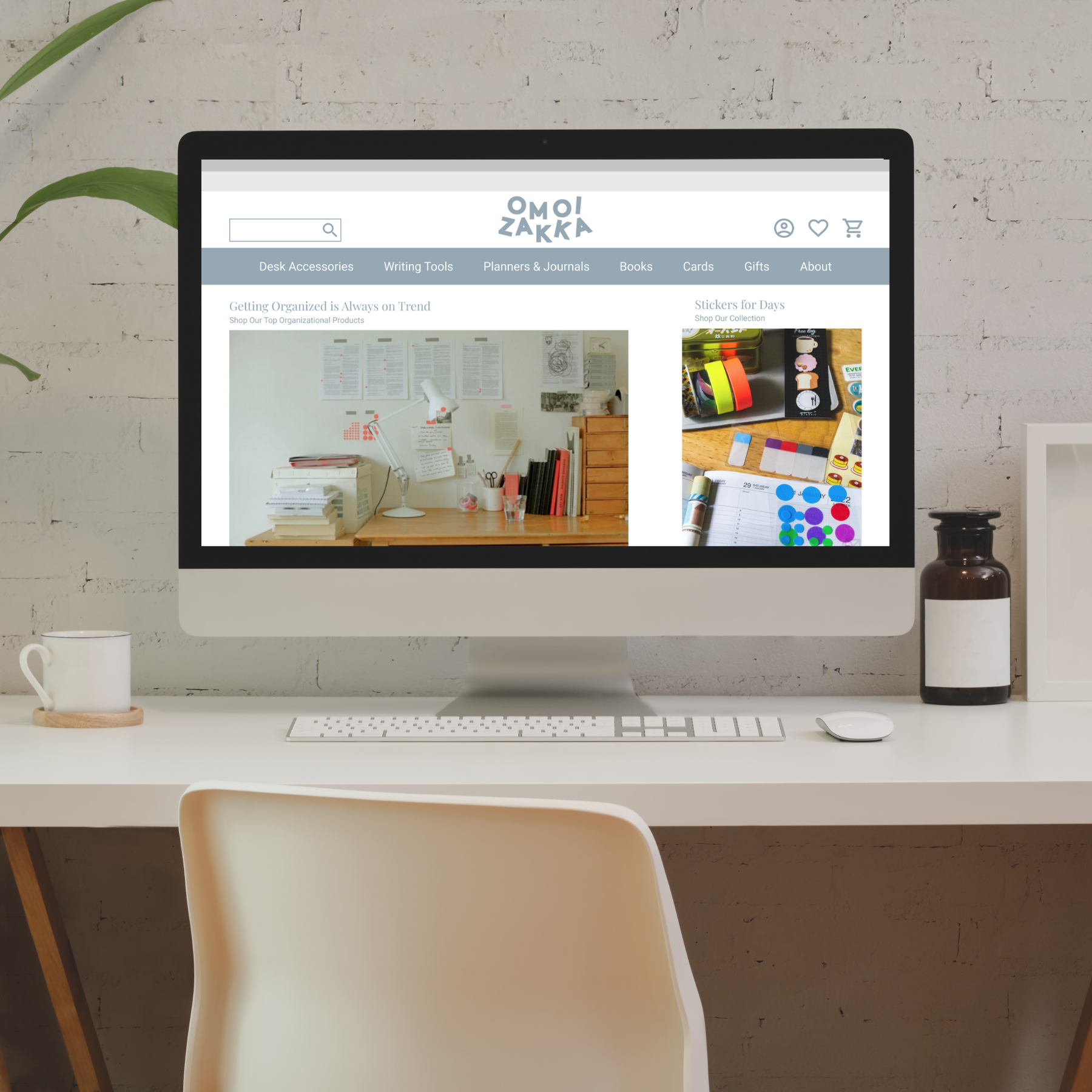
I designed to improve shopper’s experience in navigating the website for Omoi Zakka, a unique Philadelphia stationary and gift shop. Their in person shopping experience was that of exploration and delight, however their online presence did not translate well. Through an improved eCommerce website, I wanted to allow for Omoi Zakka to showcase their products while maintaining their quirky brand image.
Discover
Contextual Inquiry
I wanted to find out what a user experiences on the pre-existing Omoi Zakka website. I jumped into research by giving a user a task to accomplish on the website and recorded her experience. I had her show me how she went about finding a Valentine’s day card on the website and order it for in-store pickup.
After she completed the task, I made a customer journey map to summarize her experience. You’ll see her journey had its ups and downs, confusion, disappointment and desperation showed when she was doing her search to locate cards on the website. She was happy once she discovered their amazing products, but then disheartened again when she realized that she couldn’t narrow her results. In the end, she found a product she loved, but the overall experience left a bad impression on her. In my redesign, I wanted to eliminate the negative emotions in this journey and make it a positive experience.
C&C Analysis
I conducted competitive and comparative task analysis research. I went on the pre-existing website and mimicked the steps of purchasing a card. I then went onto other e-commerce websites and completed similar tasks of purchasing items and noted differences along the way in key areas to make improvements as outlined below.
Navigation
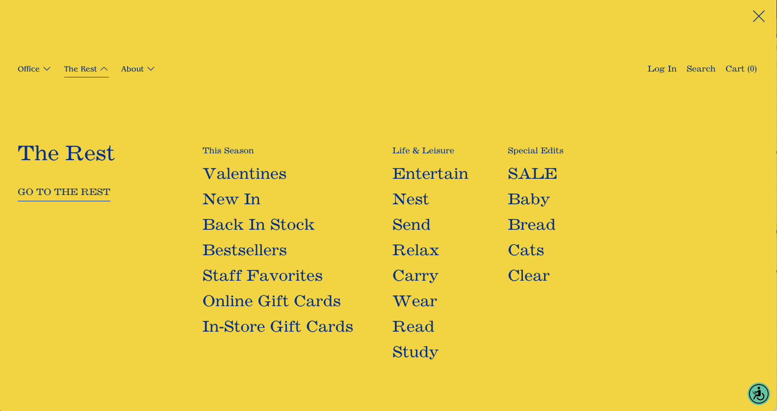
Navigation on Omoi Zakka’s website was difficult. The global options hid in the background imagery of the website. Navigation verbiage of “The Rest” and “Office” and were unclear. When expanded, the resulting categories remained unclear, such as “entertain” “send” “relax” and “carry” (above). This made finding a product difficult.
Filter & Sort
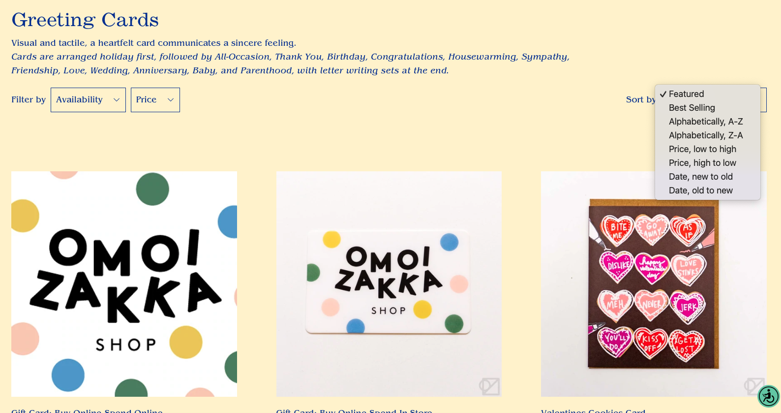
Above, you’ll see current filter and sort options on the Omoi Zakka website. The product page had no options to filter by type, only availability and price. Sort options were limiting as well. I had to go through several pages of content to see all categories and find a card to my liking for purchase.
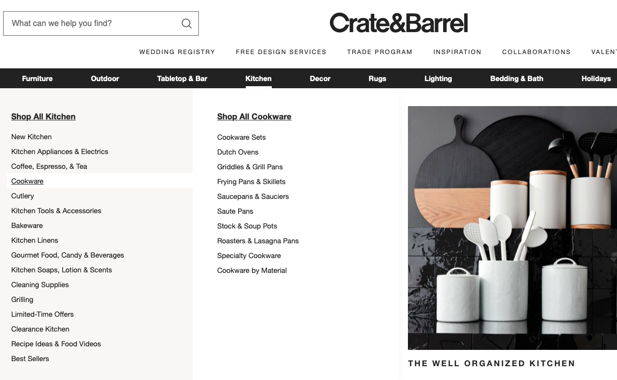
Crate & Barrel’s navigation options (above) were straightforward and I used them as inspiration for my redesign. I was able to navigate to find my product to purchase and they included primary, secondary, and tertiary navigation to narrow my options. They also targeted product collections to me in their drop down.
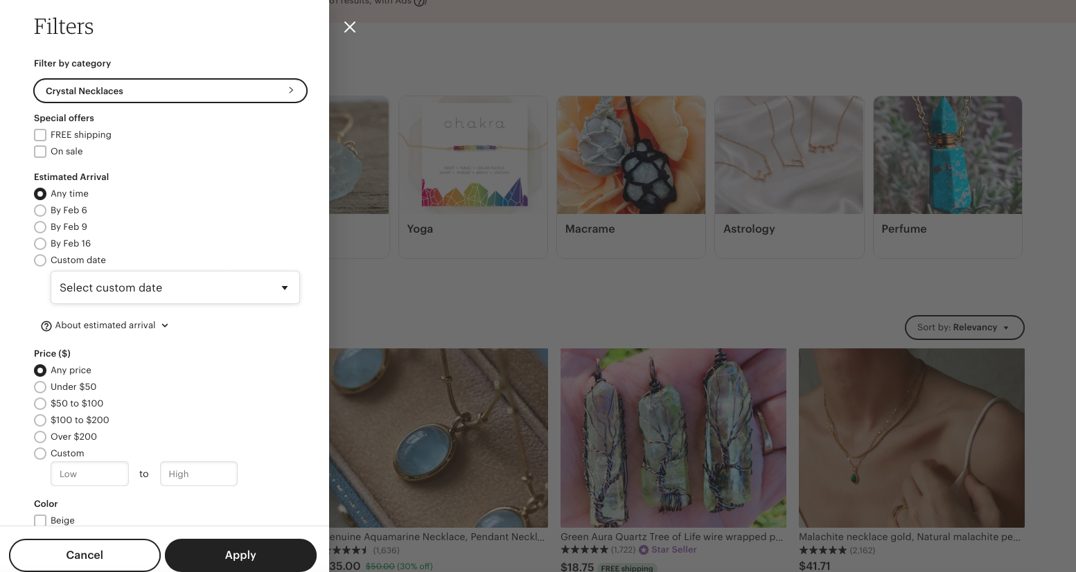
Etsy (above) made filtering easy when searching for a product. They had several options for filtering and sorting and it was personalized to the product.
Reorganized Information Architecture
I conducted an open card sort in order to create a navigation system that “made sense” to users. I pulled products from the Omoi Zakka website, asked users to sort them into categories, and then had them give those categories titles. I filtered through the data collected to find trends and establish the best navigational system to allow for simple product discovery. This card sort produced the end product of 7 global navigation categories and 33 subcategories.
Define
Lauren, Our Persona
I developed a persona to summarize characteristics of our users in order to keep the target audience in mind as I created the new website layout.
Meet Lauren, she is an Instagram influencer. Like most of Omoi Zakka’s client base, she is young, hip, and looking for her next unique purchase. Our goal was to make this process easy for her.
“I’m a firm believer in shopping local. There are so many special and unique places to check out in Philly! I love exploring and finding hidden gems!” -Lauren
Lauren’s Goals
Quickly discover quirky items to share with her followers.
Order online for shipping or in person pick up.
Review more products on websites to support the businesses she shops.
Lauren’s Goals Led to Critical Thinking
I brainstormed to think about how I might improve the e-commerce online experience.
How might I…
…encourage clientele to discover new original items that are on trend within the website?
…allow customers to browse online and order for in person pickup?
…ensure transparent checkout process?
…give shopper the ability to easily and thoroughly review and share products purchased online?
These prompts triggered the next problem solving steps that I took moving forward.
User Flows
From here, I decided on tasks that I wanted shoppers to accomplish on the new website prototype for testing and I created user flows to visualize how the process would work. Our first task in the prototype for shoppers was to find and order a Valentine’s day card online. Our second task was to review a previous purchase made on the website and include a photo and video in the review.
Task One: Find and order a Valentine’s day card.
Task Two: Review a previous purchase and include a photo and video.
Design
Sketches & Wireframes
After the user flows had been established, I went on to the sketching stage to establish the initial layout of the website. From there, I developed grey scale wireframes and incorporated key elements that I identified in the C&C analysis, such as clear global navigation, accordion style drop down options, and filter/sort capabilities. Shown below are the evolution of my product results and product view pages, from early paper sketches to grey scale digital wireframes in Figma.
Color Theory & Application
I examined the pre-existing website and noted the current use of color. The below yellow background color caught my eye to explore, however I wanted to incorporate it in a more thoughtful and subdued way. The color yellow in general conveys meanings related to joy, happiness, and energy. The in-store experience at Omoi Zakka is both youthful and energizing, so I wanted to maintain elements of bright coloring to place emphasis on completed actions. Yellow is typically a color that the eye will gravitate to first, so I wanted to thoughtfully place it throughout the new website.
Prior to moving forward, I explored new combinations based off of the yellow color that I identified on the current site and found a shade of blue (shown below, to the left HEX #96ABB3) that I decided to implement. This new color came from observing the split complementary color scheme based off of our original yellow. The color blue conveys feelings of trust and stability, so I decided to implement the blue color throughout the new website layout to help establish the site as a trusted e-commerce platform. The remaining three unused colors across this scheme could be considered for future use on the platform or in marketing materials for company promotions.
Below is an outline of how both Blue (HEX #96ABB3) and Yellow (HEX #FEF0BC) were thoughtfully applied to the web design. Blue would be used in contrast with White (HEX #FFFFFF) for navigation, icons, buttons, site text, etc. Alternatively, Yellow (HEX #FEF0BC) would be used purposefully throughout the website to draw users attention to signify completed tasks such as adding an item to a shopping cart (shown below), favoriting an item, or providing a star rating, among other actions.
From here, I finalized my Figma prototype and moved onto user testing.
I gave 5 users 2 tasks and recorded their experiences in the prototype.
All users were able to successfully complete the tasks and they provided me with feedback for improvements.
Although the prototype experience for users was overall positive, our testing resulted in 4 main iterations.
Iterations
Iterations #1 & #2
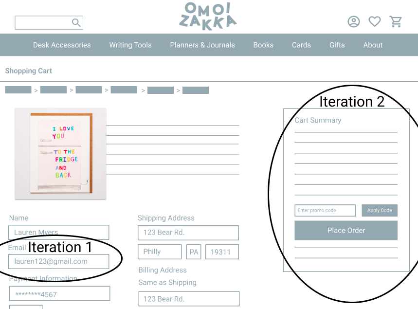
One user noted the absence of an email entry field in the checkout process. She was confused that she wouldn’t get an email receipt because she didn't enter her email when ordering the card. I added an email field so that shoppers would receive email confirmation after placing an order if they were not logged into their account.
Users found the yellow box in the cart summary section to be distracting. In this case, the color wasn’t being used to signify an action completed, as it had been used in other areas of the website. I decided to simplify the look of this page and only use the yellow color to signify completed actions and to more thoughtfully incorporate the element of bright color into the design to draw user attention only when needed.
Original Design
Iterated Design
Iteration #3
Users noted that they wanted an additional way to access their cart after adding an item. In addition to being able to click the shopping cart at the top right of the website, I added the clickable link of “View Cart” with our automated alert that appeared when an item had been added.
Original Design
Iterated Design
Iteration #4
In the second task, shoppers noted confusion about where to go to view previous purchases in their profile. They wanted more prominent navigation, so I added it in two different ways. I added profile navigation when a user clicks on the profile icon and also added options for navigation across the top banner of the profile page. In moving forward, I would continue to conduct user testing to clearly define which of the two placements was ultimately preferred by shoppers.
Original Design
Iterated Design
Mid- Fidelity Prototype
After implementing both functional and design iterations, I finalized my initial website prototype for the new layout specific to my two shopper tasks. The resulting prototype represented a user experience that made the overall shopping experience more intuitive and simple for shoppers like Lauren to discover and review products.
Lauren’s First Task
Find and order a Valentine’s day card to be picked up in store. See full Figma prototype video below.
Lauren’s Second Task
Review a previous purchase on the website and include both a photo and video. See full Figma prototype video below.
Next Steps
Test prototype iterations implemented with users to ensure quality of shopping experience and profile navigation.
Determine and implement unique filters and sort options for product-specific pages through user interviews and card sorting exercises.
Develop product recommendations based off of searches and recently viewed/purchased items.
Create rewards program for shoppers. Research and develop program based off of actual customer preferences related to rewards and savings.
